Friday, December 30, 2022

Fiscal-monetary interaction


An email correspondent sent the above graph. The title is [Federal Reserve] Liabilities and Capital: Liabilities: Earnings Remittances Due to the U.S. Treasury.

The Treasury pays the Fed interest on the Fed's asset holdings. The Fed pays interest on reserves to banks and to other financial institutions that have, effectively, deposits at the Fed. As long as Treasury interest is greater than interest the Fed pays, the Fed makes money. It spends some, and returns the interest to the Treasury. The Fed also issues cash, which pays no interest, so the Fed makes steady money on the difference between interest bearing assets and the zero return of cash. 

But when short-term rates the Fed pays rise sufficiently above the Fed's interest earnings, the Fed loses money. It stops sending interest earnings to the Treasury. The graph is in essence the amount the Fed owes the Treasury in this scheme. Usually the Fed makes some money -- the graph goes up -- then the Fed pays out to the Treasury and the graph goes back to near zero. When the Fed loses money, the Treasury doesn't send a check. Instead, the Fed accumulates its losses, $16 billion so far. The Fed then will wait to make this amount back again before it starts sending money back to the Treasury. 

For broad brush macroeconomics, the Fed and Treasury are left and right pockets of the federal government. As interest rates rise, the government is going to pay more interest on its debt. 

The Fed's massive QE operation has undone a lot of the Treasury's long-term debt, which would have kept interest costs from rising so fast. So, really, this is just a measure of the extra interest on the debt that QE has caused.  The Fed and Treasury like to think of themselves as more separate, so there are political and institutional implications.  

$16 billion isn't a huge amount in today's Washington, but the graph is interesting on a process starting to get under way.  

No, the Fed is not about to go bankrupt. The Fed can print money, so conventional bankruptcy that happens when you can't pay bills simply cannot happen. If the Fed had no assets at all, it could simply print money -- create new reserves -- to pay the interest on outstanding reserves. That would only come to an end if the Fed had to soak up reserves or cash by selling assets to avoid inflation.

The accounting is a little weird. The Fed only counts interest income, and ignores mark to market values. So this is the accumulated amount of interest received on the Fed's assets minus interest paid on reserves. The Fed has, of course, taken a bath in mark to market values as interest rates rise. The Fed doesn't worry about it, because it can hold the securities to maturity. However, this means the Fed will likely have to hold them to maturity. The Fed now has $8.5 trillion of assets. A speedy "quantitative tightening," selling those assets, would force it to recognize mark to market losses. So don't count on that event. Fortunately, in my view of the world, QE didn't do much but shorten the maturity structure of outstanding debt, so the lack of QT won't be missed. Others disagree. 

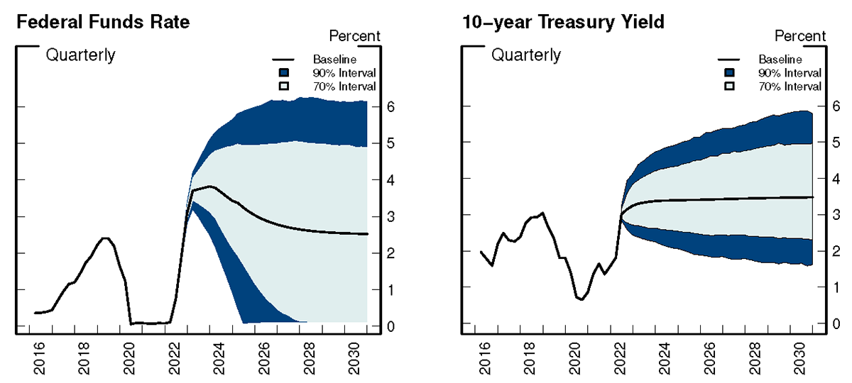
Alyssa Anderson, Philippa Marks, Dave Na, Bernd Schlusche, and Zeynep Senyuz at the Fed have a very nice analysis of this situation, along with explanations of how it all works. They use the following projections of interest rates


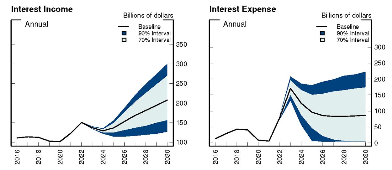
With those projections, here's what happens to the Fed's interest income and expense: 

Notice how interest income dips 2022-2025 even though interest rates are rising. The Fed is still sitting on old bonds with very low interest rates. Interest income starts rising when these mature, and the Fed reinvests in new bonds with higher interest rates. Interest expense largely follows the reasonably rosy scenario that the funds rate eases as inflation goes away. (Top left graph looks like botton right graph.) 

Their bottom line 

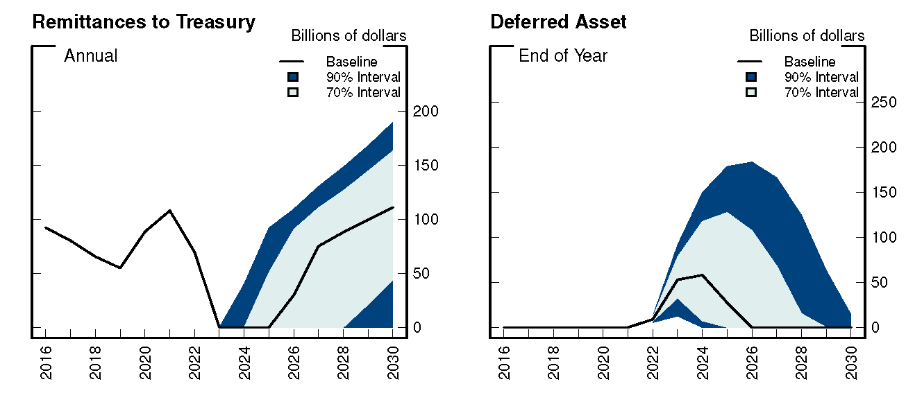
Remittance to the treasury stop for a few years, while interest expense is greater than earnings. But then pick up again once the Fed can roll over its asset portfolio. The "deferred asset," which is the inverse of my top graph rises, rises considerably above today's $16 billion, but then goes away once the Fed rolls over its assets and interest earnings recover. 

All well and good, but the grumpy economist can think of plenty of ways this can go wrong! Suppose inflation does not fade away and substantial interest rate hikes are needed. Suppose, for example, we replay 1980, when short-term interest rates shot up to nearly 20%. Except this time with a huge balance sheet, and paying interest on reserves? 


The Fed's $8.5 trillion assets correspond to about $6.2 trillion of interest-paying liabilities, including $4 trillion reserves, plus $2.3 trillion currency. Even assuming people still will hold that much currency as interest rates spike (they won't, and didn't in 1980), $6.2 trillion times 15% equals nearly $1 trillion of interest expense. Now we are starting to talk some real money. And the Fed's maturity shortening exercise will start to bite the Treasury as well. 

We now have also seen that negative long-term bond rates are possible. A perpetually negatively sloped yield curve is also possible. If we go back to that, central banks holding long bonds and issuing cash will have to rethink their model.

The real fiscal issue will be how higher interest rates lead to higher interest costs on the federal debt. The Fed here shortened the debt, making that issue bite a little sooner than it otherwise would have. But the main problem is the overall amount of debt and how short term that is already. 

HT thanks to some anonymous correspondents who helped me puzzle out how this works (I hope I got it right) and pointed me to the Fed study. 


Wednesday, December 28, 2022

Calomiris on Gramm Ekelund and Early on Income Distribution.

Charles Calomiris has a splendid WSJ review of a great book, "The Myth of American Inequality" by by Phil Gramm, Robert Ekelund and John Early.

It is a "'a truth universally acknowledged,' according to the Economist magazine in 2020" that 

little progress has been made in raising average American living standards since the 1960s; that poverty has not been substantially reduced over the period; that the median household’s standard of living has not increased in recent years and inequality is currently high and rising 

Most of all the last one. 

All of this is false. Most of all the last one. 

1) Income. The central jaw-dropping, astonishing fact: The statistics you read about income and income inequality ignore taxes and transfers. By doing so, of course, they create a problem that is immune to its purported solution! 

Especially on the low end, transfers including in-kind transfers (housing, medical payments, etc.) are a huge part of consumption and properly measured income. 

Pay especially attention on the left hand side of the graph. Actual income is essentially flat in the first three quintiles of earned income. 


Gramm Ekelund and Early are fond of quintile bar graphs, like this one. The bars are pretty flat from the lowest to third decile, and transfer income is a big part of the story. 

More, do just a little bit of adjustment for household size. Single person households are obviously going to have less income than two-earner households. Households with children have less per capita income, but people with kids may be more likely to work. How does it work out? In per capita terms (middle) actual income, including taxes and transfers is almost completely flat in the first four deciles. 

2) Work. Well, a good anti-capitalist might say, this just proves the point. Look how dreadful the distribution of income before taxes and transfers is, and admittedly getting wider. Raw capitalism is destroying the poor, and only the maginficence of the welfare state is keeping them going. One answer might be, ok, but let's at least measure how we're doing rather than just keep publishing the false statistic as if we're doing nothing. 

But there is a better answer. Why is it that the pre-transfer earnings of the lower quintile are so low, and pre-transfer inequality getting larger? Because they aren't working. 

Average hours per week 17.3 vs. 38.6; workers per household from 0.2 to 2.0. Sort of mechanically, if you don't work you don't have earned income.

Why has work collapsed in the bottom decile? Here we might have a big debate. $11.76 per hour (2017) isn't a lot. But the previous graphs certainly contain a suggestion worth pursuing: The effective marginal tax rate in the lowest three quintiles is effectively 100%. Earn a dollar, and lose a dollar of benefits. Why work?  

Gramm Ekelund and Early are careful, and don't make any causal assertions here. They don't really even stress the fact popping from the table as much as I have. But the fact is a fact, a nearly 100% tax rate + an income effect isn't a positive for labor supply, and the amount of work in lower quintiles has plummeted.  This is a book about facing facts and this one is undeniable. 

One might also complain that people don't value in-kind transfers. Medicaid is expensive to the government and awful. Government provided housing isn't great and it isn't where you might want to live. Gramm Ekelund and Early value transfers at cost. If $20,000 worth of Medicaid is only worth $5,000 to the recipient, there is a problem with Medicaid! 

3) Time.  The Standard Narrative says that things are getting worse over time, and people are stuck in their income bins. Neither is true. Actual income, after transfers, and properly accounting for inflation -- has not been stagnating or declining over time. One reason is, again, the simple failure to account for the enormous increase in transfers. 


Again, the first three deciles are dramatic. The decline in earned income in the top is indeed worrisome but it comes as above from a decline in work. Discuss among yourselves where that comes from. 

A second feature is that the CPI does a poor job of measuring living standards across long periods of time, because it doesn't account well for quality improvement and the fact that people shift consumption to cheaper items. Do you really want a small 1970s house, a Ford Pinto, and medical care that can't cure most cancers? 


Bottom line, here is the fact: 


Oh, and being stuck is also not true. There is a lot of turnover of quintiles, and overall growth does help even those who stay in the same quintile. And, as you might guess, the most likely to underperform their parents are the kids of the super-rich. Elon Musk's kids are very unlikely to do as well as he did, and there is a lot of luck in being super rich. 


There is lots, lots more in the book, including the fortunes of the super-wealthy. There is also a lot on "poverty." As you can guess official definitions of poverty leave out many transfers. 

As Calomiris sums up, 
This book is written in straightforward American English, not in economic think-tank jargon. It shows clearly how each element of the analysis (taxation, transfers, inflation adjustment) contributes to its conclusions. Graphs and tables are comprehensive and comprehensible. The style is lively and lucid...
The analysis probes deeply to demonstrate the robustness of its conclusions..
Most important, the authors don’t clutter their analysis with contentious approaches to measurement, and they limit their policy recommendations to those that flow self-evidently from the facts they document. It is encouraging that three disparate economists can together write an objective book about the measurement of living standards, poverty and inequality without engaging in partisan advocacy that undermines their findings. (“While we each have our opinions and political views,” writes Mr. Gramm in a preface, “we share a desire to get the facts straight.”)

My sense is that the book is not having the impact it should. Economists love complex empirical work, and the mainstream media does not, ahem, appreciate a book that so transparently demolishes the Standard Narrative. 

It's a great read. 

*****

Update: Much subsequent discussion here and on twitter revolves around just what's included and omitted in "income" by various authors. An email correspondent, frustrated with Blogger's comment feature (me too) sends the following response to Joe Smith, below: 

A place to start is a 2018 Cato paper by John Early "Reassessing the Facts about Inequality, Poverty, and Redistribution". It includes a version of Figure 2.1 above, explanations of major categories, and lists sources. 

I went to Early's very nice paper, and here are some excerpts: 

  • Census money income estimates explicitly exclude the following:4
  • The Earned Income Tax Credit (EITC)
  • The monetary value of benefits from the Supplemental Nutrition Assistance Program (SNAP), more commonly known as food stamps
  • Free or subsidized medical care such as Medicaid and the Children’s Health Insurance Program (CHIP)
  • Free, subsidized, or controlled rent or other “affordable housing” schemes
  • Heating subsidies
  • Free or reduced-fee social services such as daycare, tax preparation, or meal services

The EITC is given to low-income families with at least one employed person. In 2015, the annual credit was as much as $6,242 per household and was given to households with incomes as high as $53,267. The EITC is a “refundable” tax credit, meaning that if an individual owes no income taxes, money equal to the entire credit is sent to the filer. The EITC has all the characteristics of money income, but it is not counted as such by the Census Bureau.

The government has defined the EITC and other refundable credits as “negative taxes.” Government reports of expenditures are understated because the money paid for the EITC payments is not included. Taxes are also understated by the amount of the EITC because it is subtracted from the reported tax collections.

SNAP funds are paid as money on a debit card, but they are defined as in-kind income and not counted because they can nominally be spent only on food. Rent subsidies, free medical care through Medicaid, and any free social services are also deemed as in-kind income and are excluded from the calculations.

I found the last sentence revealing. Philosophically, the census wants to leave out "in-kind income." But of course for evaluating people's standard of living that matters a lot. It's not wrong, it's just a definition, useful for some things but not for others. Like, evaluating people's standard of living. 

Interesting as well, 

Compared with amounts reported to the Internal Revenue Service (IRS), the CPS underestimates retirement income by at least 60 percent in each income quintile. IRS data show 50 percent more households with private pension income, and for those households reporting pension income the IRS shows 50 percent more income than the CPS does.6 No one would report too much income to the IRS, so the higher IRS comparisons are reliably the minimum limit of underreporting.

There is a lot more in the paper, and I'm perhaps doing the book a disservice, as I recall from reading it last summer that it is very clear and transparent about what the definitions of "income" are and just why they come to such different conclusions from others. But I add this to give a flavor of the issues. 

****

Update: I forgot perhaps the most important thing I learned reading this book. (I'll have to come back and make this a separate blog post at some point.) Income based social programs are based entirely on a meaningless concept of income.  You get money and help for being "poor." But that only covers your market income. The marginal tax rate for earning a legal extra dollar is about 100%. But the marginal tax rate for getting one more social program dollar is zero! Spend a day figuring out how to sign up for another program,  or spend a day looking for a job? The incentive is clear. 


Monday, December 26, 2022

FTPL revised Ch. 5 draft

The book isn't out yet, but I can't help myself... A revised draft of Chapter 5, fiscal theory in sticky price models is up on my website here. Giving talks over the last year and writing some subsequent essays, I see clearer ways to present the sticky price models.  Bottom line, these three graphs provide a nice capsule summary of what fiscal theory is all about: 


Response of inflation, output and price level to a 1% deficit shock, with no change in interest rates. Bondholders lose from a long period of inflation above the nominal interest rate. Inflation goes away eventually on its own. 

Response of inflation, output and price level to a permanent interest rate rise, with no change in fiscal policy, and sticky prices. The main line uses long-term debt. The omega=1 line uses roughly one year debt. The omega = infinity line uses instantaneous debt. Higher interest rates can temporarily lower inflation with long term debt. With short-term debt, despite sticky prices, inflation follows the interest rate exactly. Sticky prices do not imply sticky inflation. 


Responser to a 1% fiscal shock, with a monetary policy response with Taylor coefficient one, and long term debt. By shifting inflation forward, the central bank eliminates almost all output volatility. The fiscal shock falls on long-term bondholders, who suffer a price drop at time 0. 

Details and interpretation in the new draft. 

I'll keep updating as we go along. Comments and typos welcome. 

And... there are still 4 days to go of the 30% discount at Princeton University Press. Use code P321. 

Happy new year to all.